


The Mister Spex Glasses Configuration Experience - Redesigned
Mister Spex, a leading online eyewear retailer, has identified areas in the current glasses configuration process that can be improved to enhance user satisfaction and streamline the ordering journey. This project focuses on redesigning the user interface to make it more user-friendly, intuitive, and visually appealing.
My RoleResearch (Internal interviews)
Ideation & Testing
Prototyping
Applying special use cases
Responsive Screendesign
TIMEResearch (Internal interviews)
Jan 2021 - September 2021
Results:
Here is a selection of “happy” path screens:
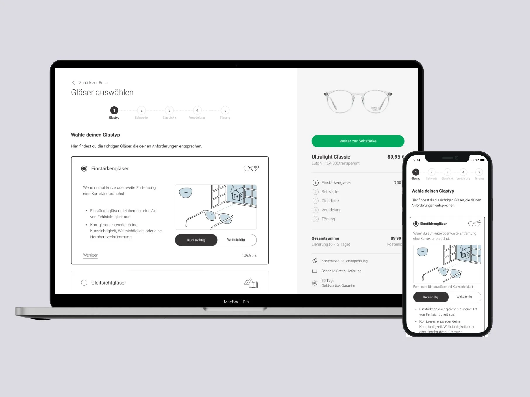
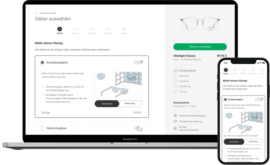
Step 1: Type Selection
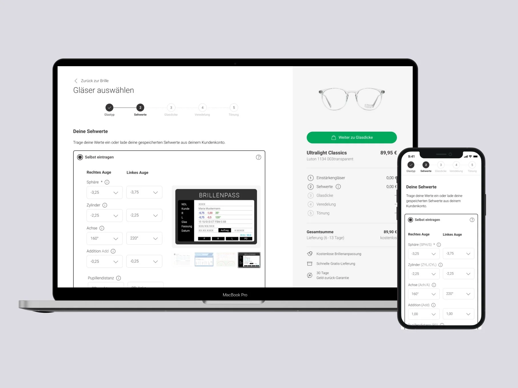
Step 2: Manual Entry of Values
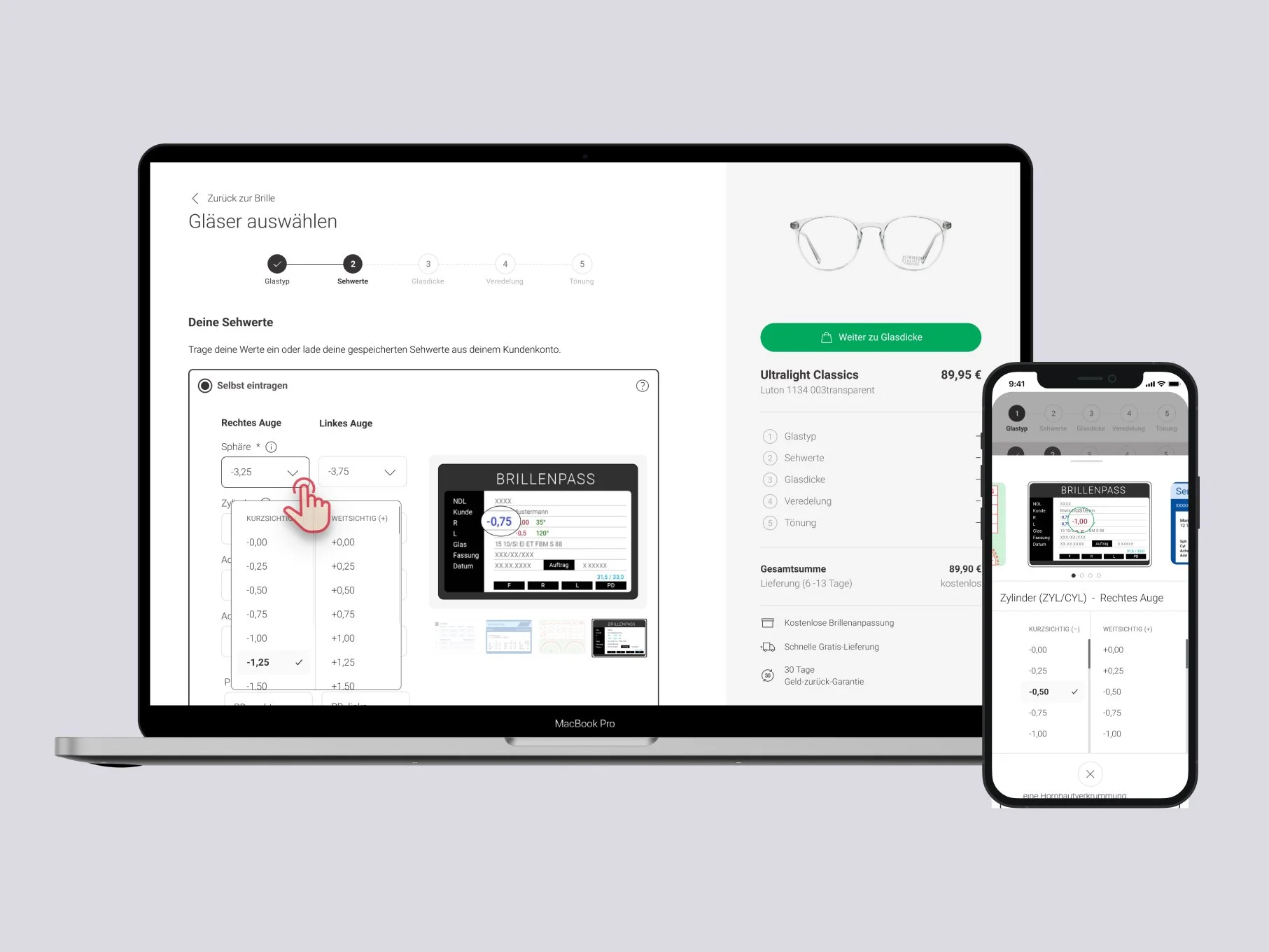
Step 2: Manual Entry of Values with the help of eyesight pass
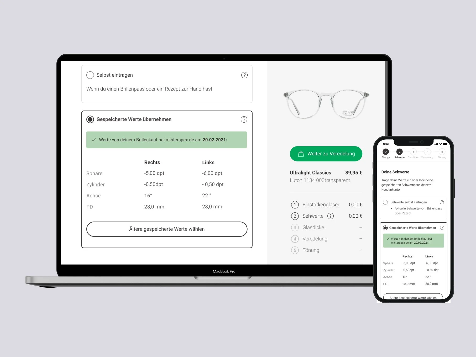
Step 2: Load saved values from account
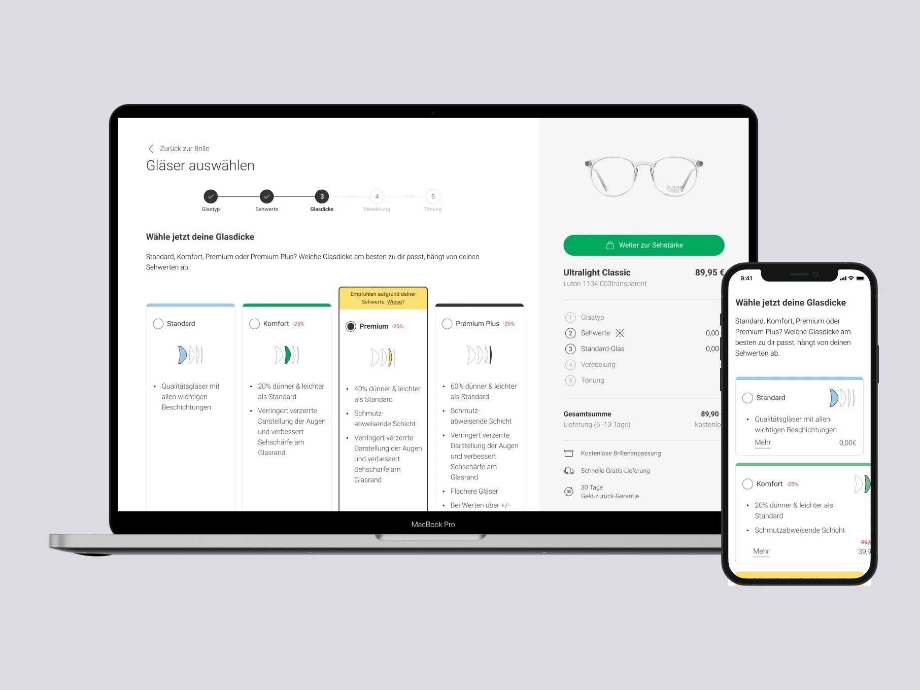
Step 3: Glass Thickness Selection
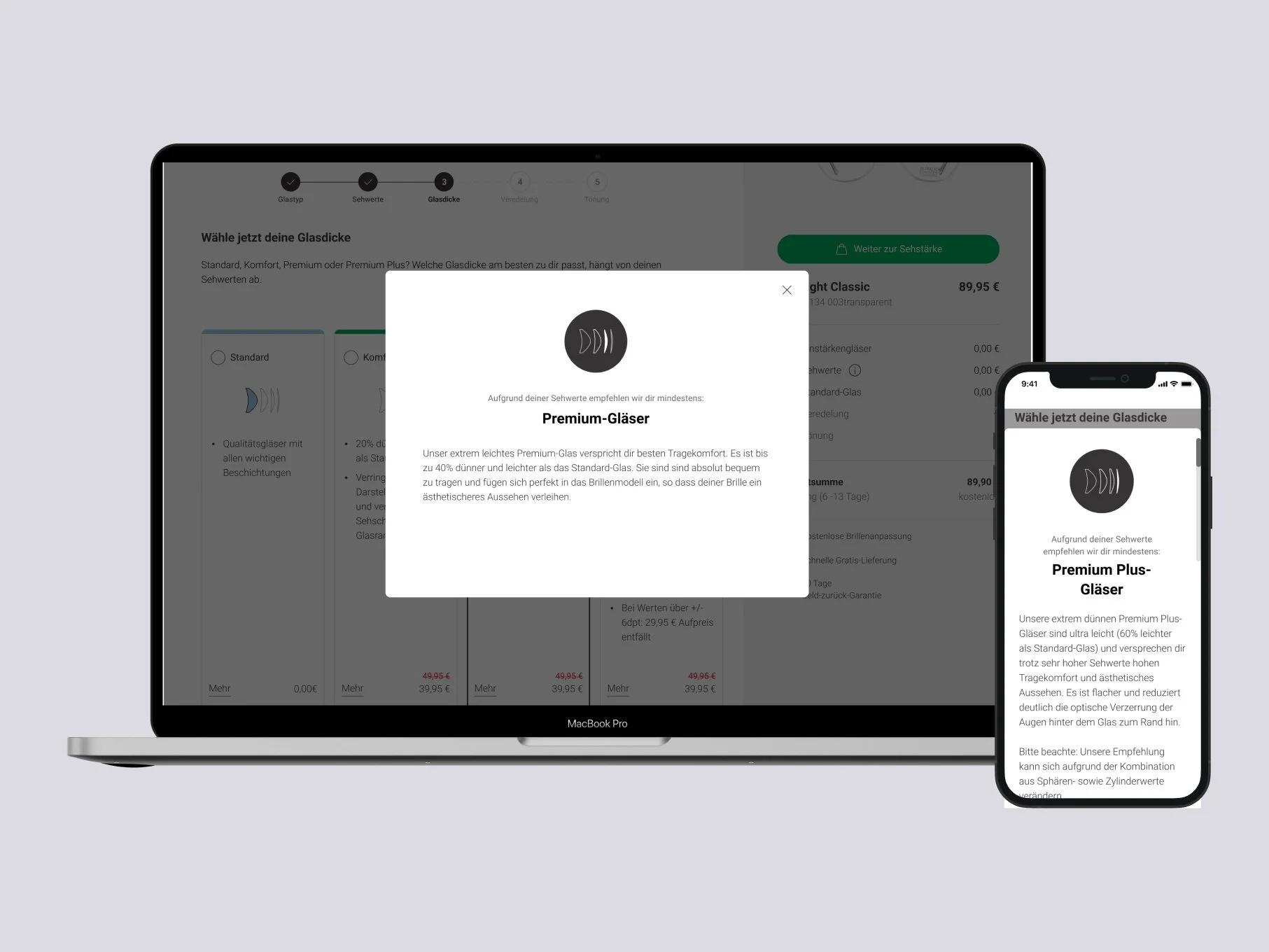
Step 3: Glass Thickness Description - Modal
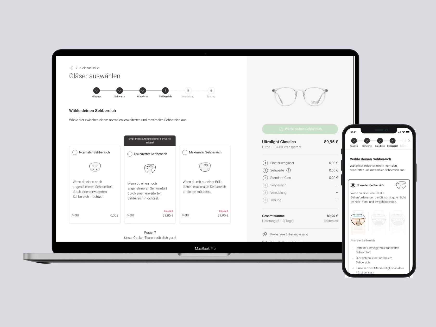
In case of multifocal glasses: Area of sight selection
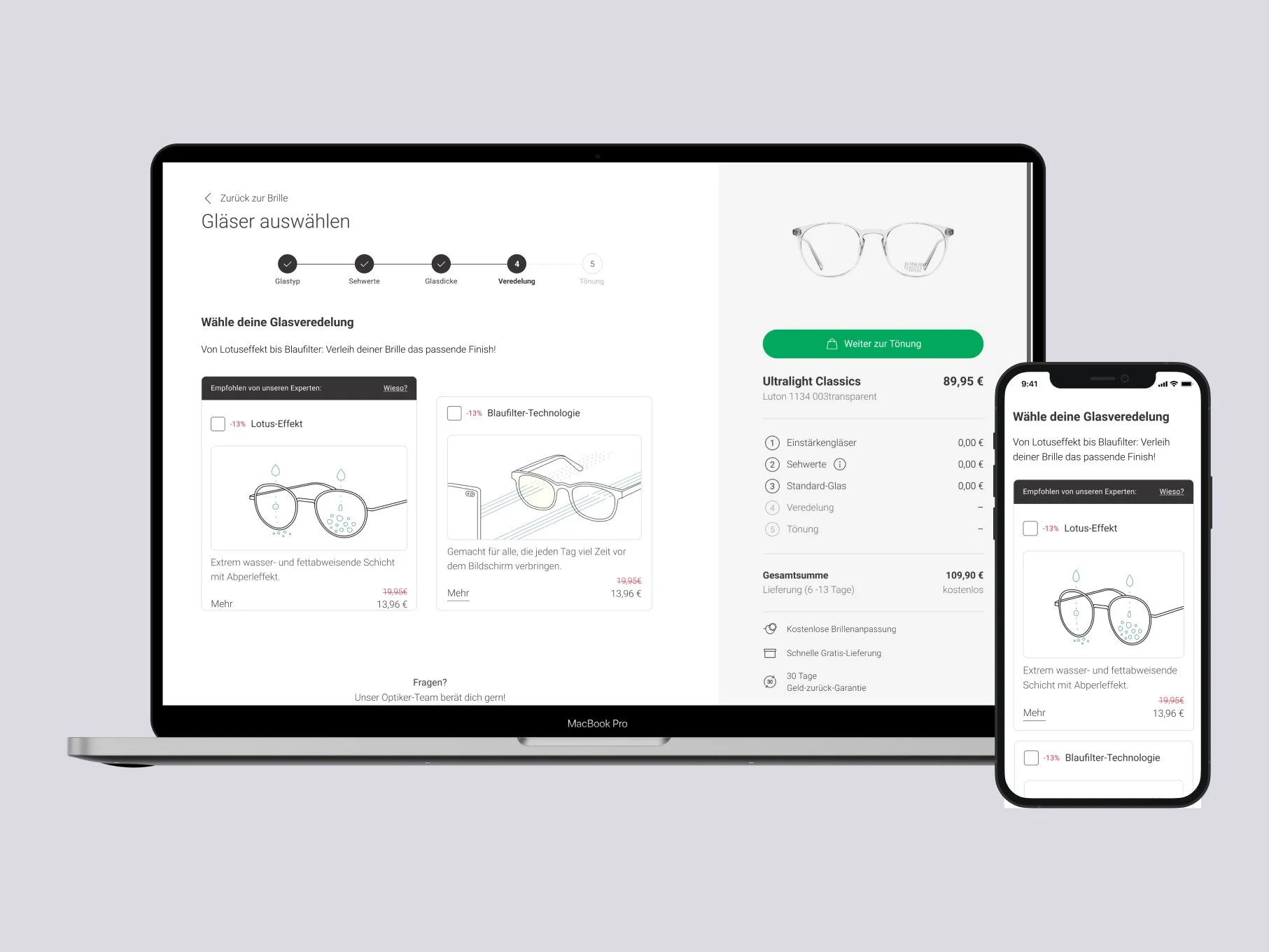
Step 5: Coating Option
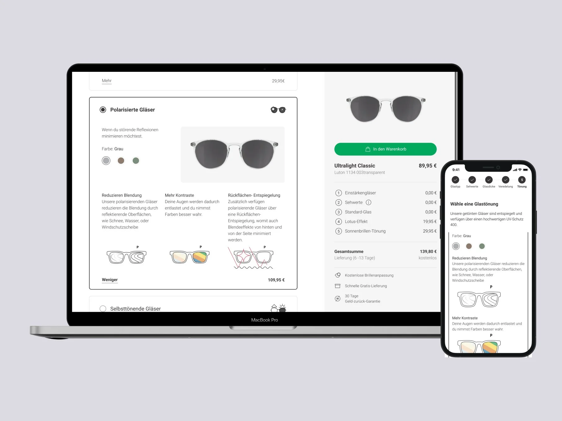
Step 6: Tinting Options
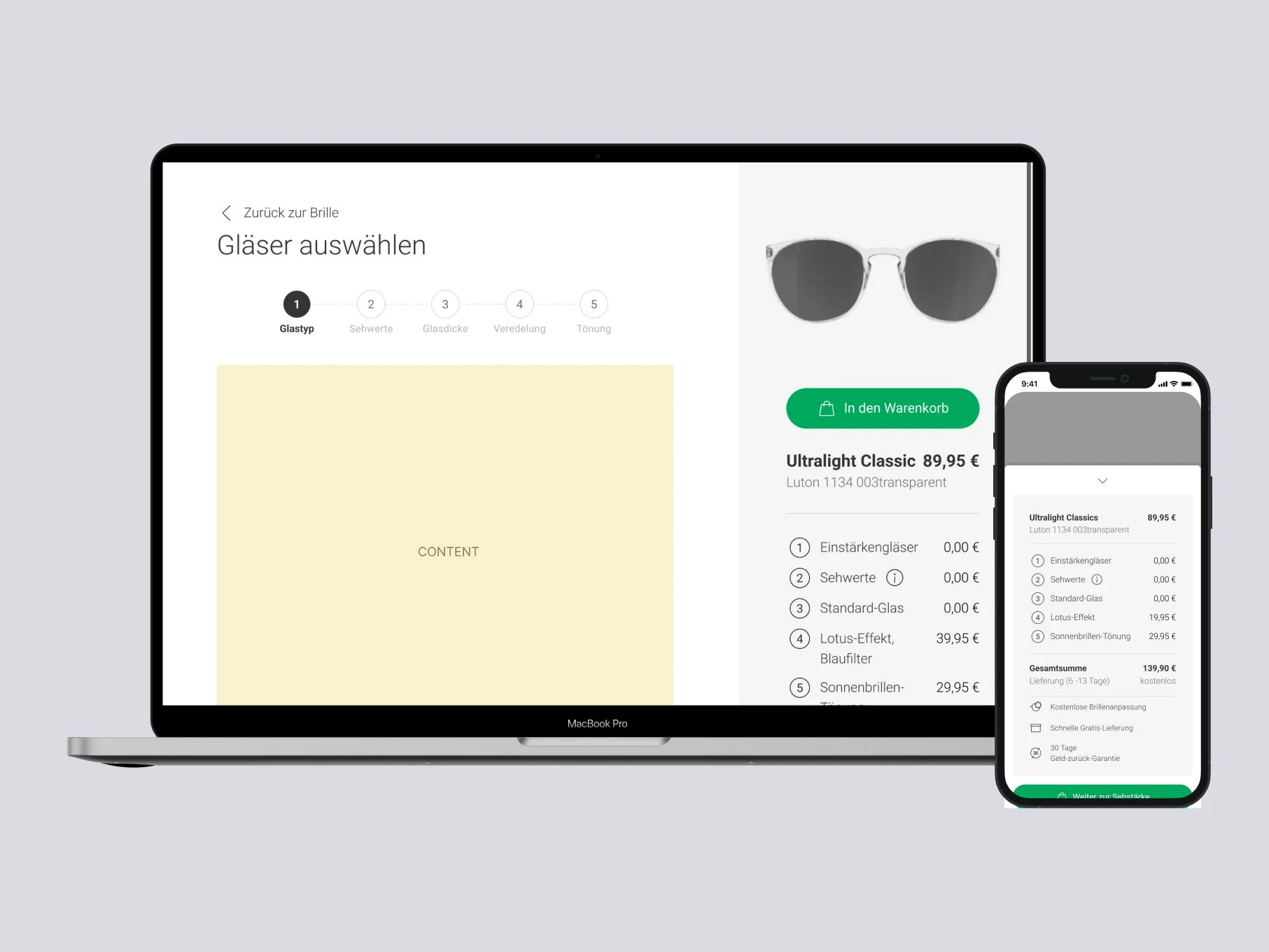
Cost Summary
Problem definition
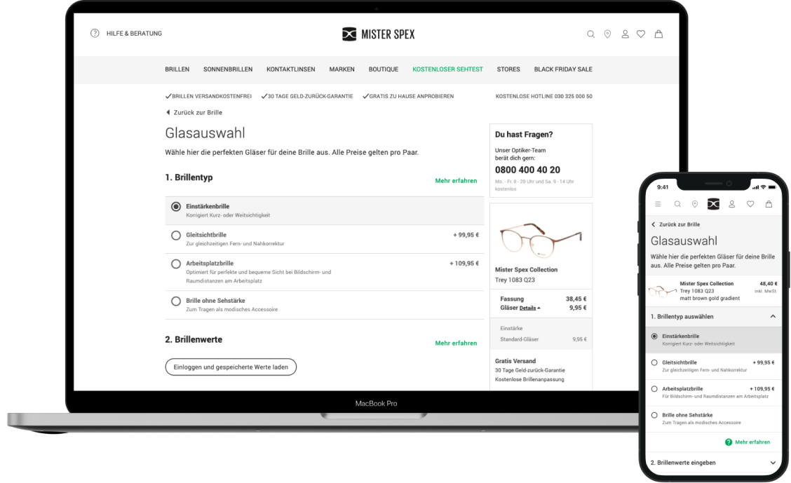
The Glasses Ordering Page is facing challenges with unresponsiveness, maintaining separate versions for mobile and desktop. The design exhibits significant differences, with the mobile version last updated in 2018 and the desktop version in 2017. From a business perspective, the focus is on upselling glass packages, lotus, and digital relax. Usability concerns include a high cognitive load, especially on desktop due to numerous options on a single page. Although users tend to leave due to high prices and insufficient information on correction values, these issues are not strictly usability-related.
Project Goals
-
Ensure Glasses Ordering Page is responsive.
Harmonize the mobile and desktop experiences.
Establish a brand-aligned look and feel. (Follow new Rebranding guidelines)
Determine the optimal structure, choosing between a single or multi-page application.
-
Maintain visit performance with a maximum allowance of -2%.
Enable the introduction of new glass options, such as reading glasses.
-
Decrease cognitive load on the page.
Enhance guidance where necessary.
Integrate additional personalization use cases to improve customer experience.
Establish meaningful connections with the app, retail stores, and the easee platform.
Preliminary insights & research
The analysis encompasses both quantitative and qualitative methods. Quantitative insights were derived from HotJar Surveys, margin and distribution evaluations, and click rates on the Glasses Ordering Page. Qualitative assessments included benchmarking, user research on the old page, two rounds of user research on the redesigned page, as well as interviews with stakeholders and regular feedback sessions. All that was provided to me by the research and ux team.
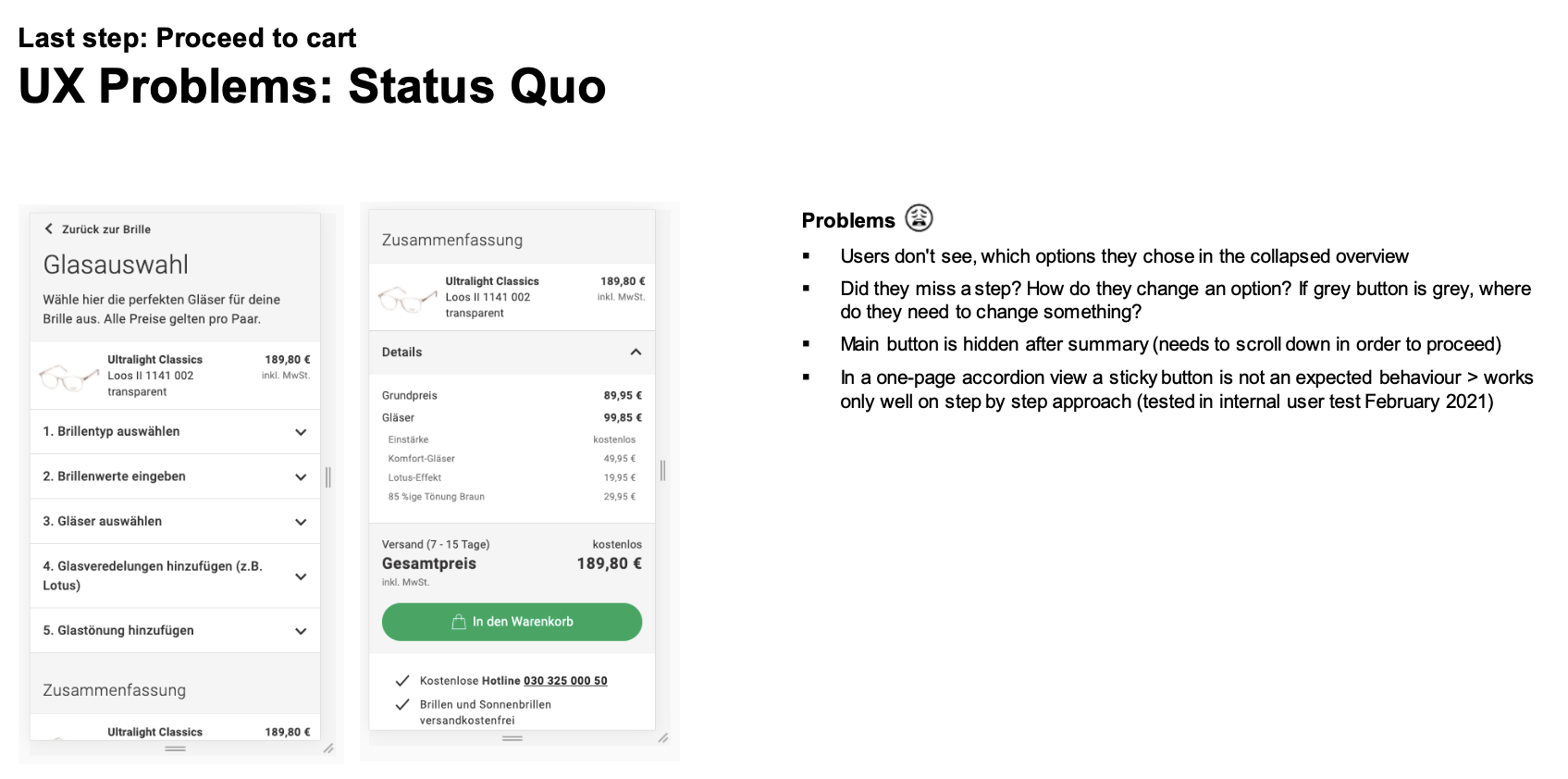
Based on the usability test result report of the research team I started to ideate some solutions to the navigational issues.
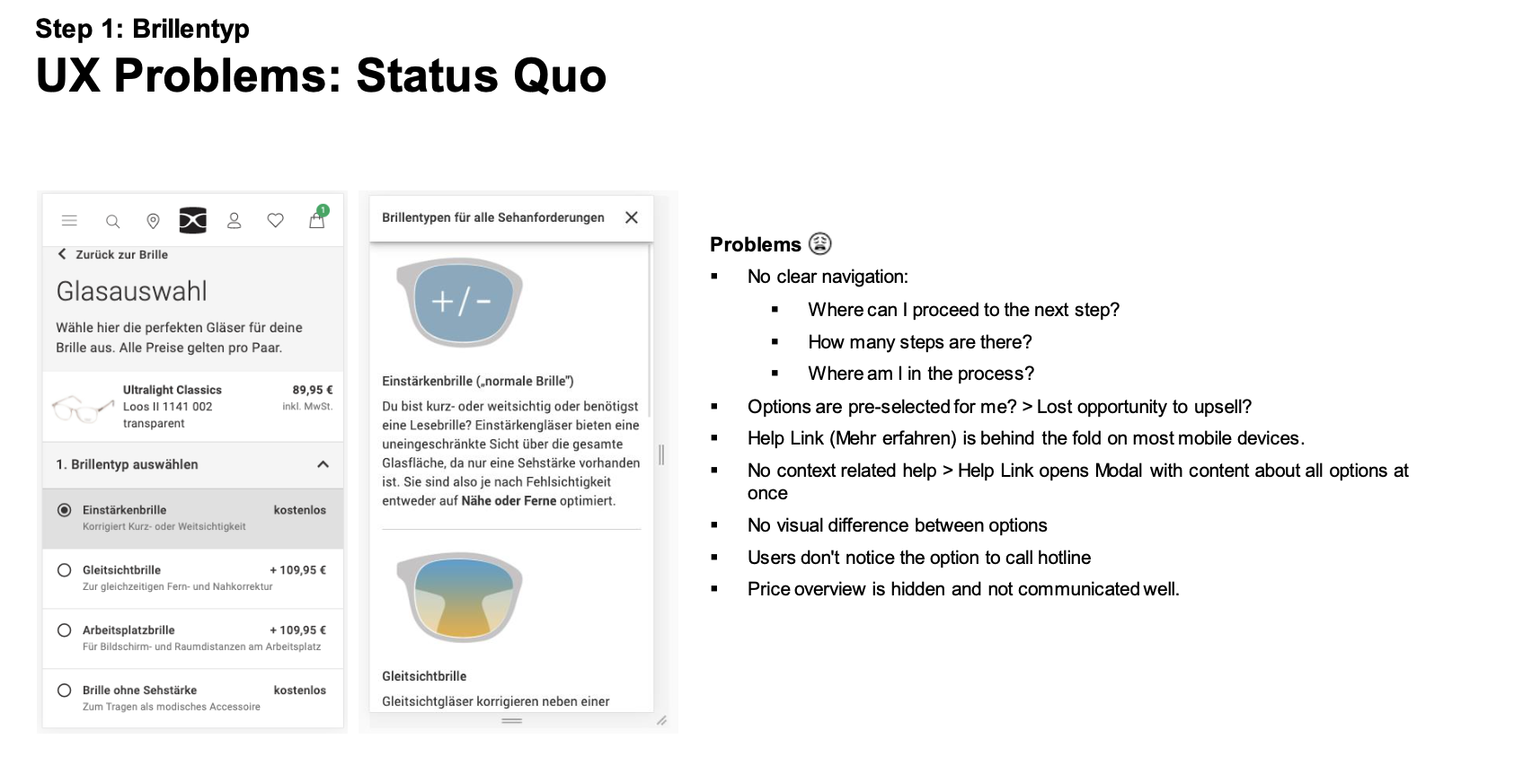
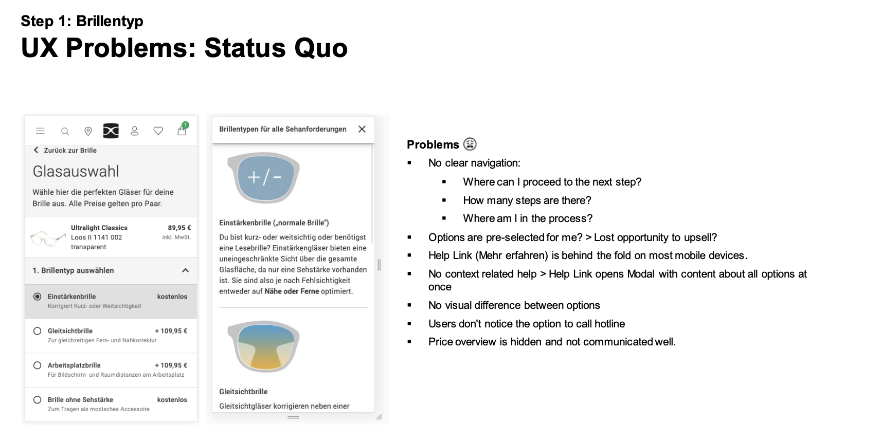
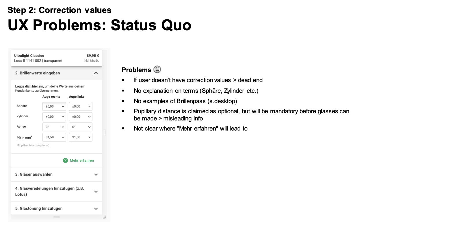
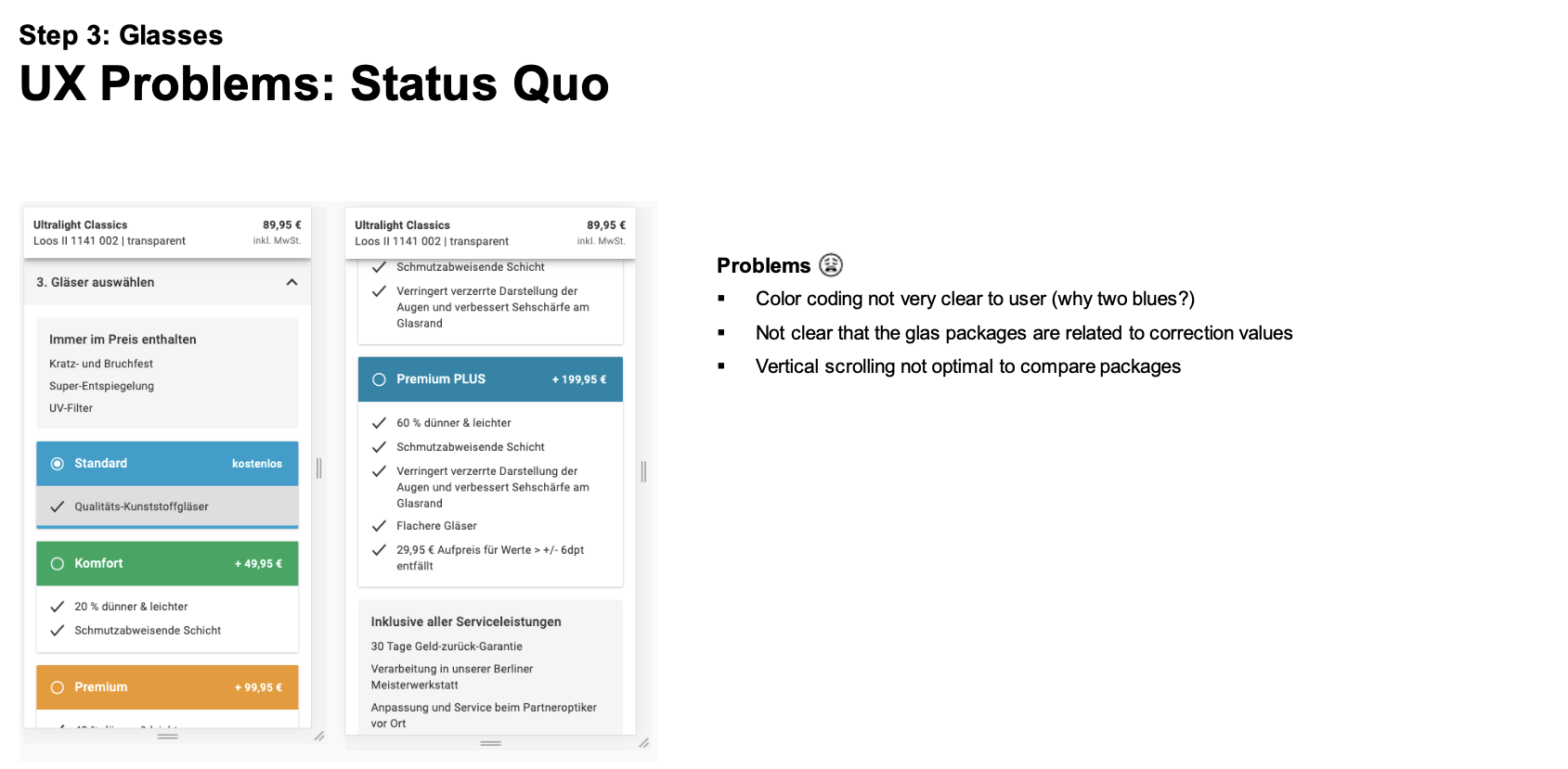
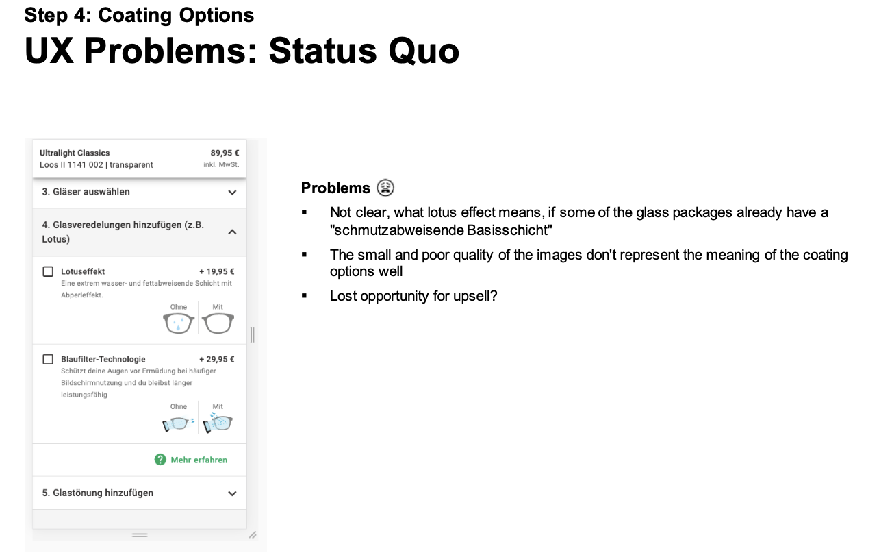
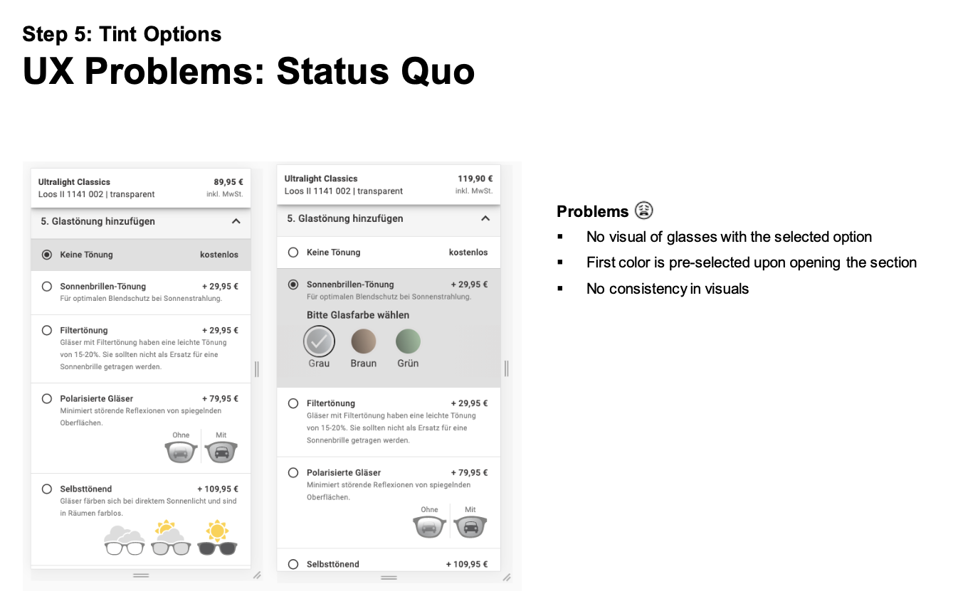

The user begins by entering the GOP, noticing the form and pricing details. Through lens and prescription input, login (if applicable), and coating/tint selection, they navigate each step with a focus on understanding options and benefits. The final submission involves a thorough review, decision-making, and a watchful eye for error feedback. This summarized journey emphasizes a seamless and informed glasses configuration process on Mister Spex.
User Journey
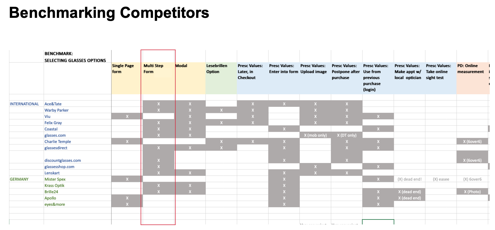
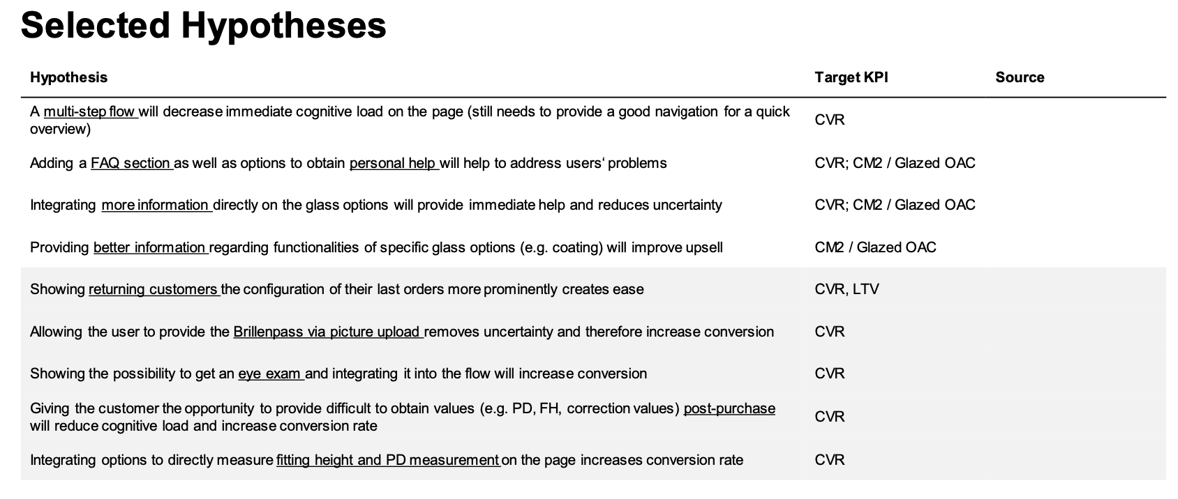
The complexity may result in users abandoning the process or seeking assistance from customer service. The need for entering unfamiliar information, such as prescription values or pupillary distance, further complicates the user journey. In cases where users lack this information, the flow cannot be completed, potentially leading to a drop in conversion rates, and users may never return to complete their purchase. So I started to ideate a multi-step-flow solution based on benchmarking and hypotheses derived from insights and user testing.
UX Ideation - How to Improve navigation and reduce cognitive overload: Multi-Step vs Accordion Flow
“
Configuration of glasses is a long and complex process leading to a high cognitive load and extended time commitment.
”
User Testing: Low-Fi Wireframes - Multi-Step vs Accordion Style Navigation
In order to determine the most effective navigational system for our users, we decided that qualitative testing would be the best course of action. By conducting thorough experiments and gathering user feedback, we aimed to gain valuable insights and make an informed decision.
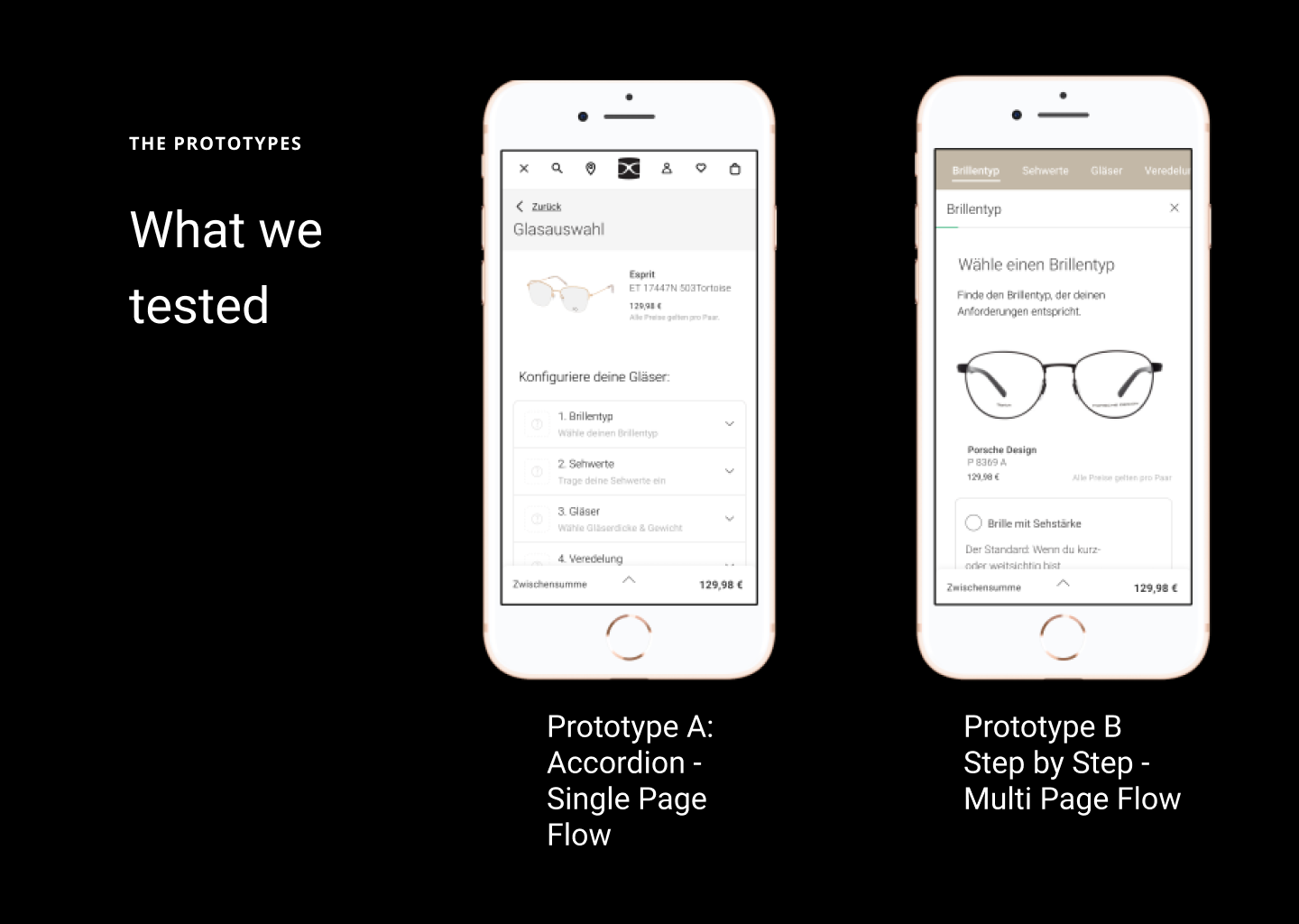
Prototype A: Accordion
Critiques: Prototype A was seen as somewhat intricate, and it wasn't clear how to proceed.
Unclear Selections: The user had difficulty understanding what selections were made and the overall progress.
Prototype B: Multi-Step
Positive Feedback: Prototype B was rated as better.
Clear and User-Friendly: Prototype B was perceived as very clear and user-friendly.
Positive User Experience: The user had a positive experience and didn't feel overwhelmed.
SWOT: Evaluating Multi-Step vs. Accordion
In terms of deciding which navigational structure is better, there is no right or wrong. We utilized the SWOT method to help us guide in the decision making process. SWOT stands for Strengths, Weaknesses, Opportunities, and Threats. It is a strategic planning method commonly used in business to identify and analyze the internal and external factors that can impact an organization or a project.
-
• Overview: page is less overloaded, user‘s focus is always directed at the option at hand, supported by user tests
• Orientation: sticky header always shows user where he is in the flow and how many steps are left, supported by user tests
• Solves „Browser Back“ Problem: currently, users often use browser back on mobile with the expectation to go to the last step in the flow
•State Of The Art: the majority of our competitors also uses multi-step, UX principles recommend multi-step for complex service pages
-
Future Proof: allows flexible addition of new options (e.g. Grinding height, Eye Exam, branded lenses, more blue filters, accessories etc.)
New Customer Acquisition & Upsell: allows us to place more information (images, videos, info text, FAQs) on the page
Data For Optimisation: a linear flow allows us to better understand where the user bounces and optimise accordingly.
-
•Validation: cannot be quantitatively and conclusively tested without bringing it live
-
Conversion Rate: the process might be perceived as more lenghty, which might result in a higher exit rate and lower Conversion Rate
More about how to utilize the SWOT method for ux
Conclusion
The feedback suggests a focus on clarity and user-friendliness. In the user test the Accordion was perceived as more successful, while the Multi-Step has opportunities for improvement in terms of structure and clarity. In future iterations, it may be beneficial to emphasize the positive aspects of the Multi-Step and address the challenges of the Accordion to enhance the overall user experience.
Comparison old vs new
Next Steps
Continue with Multi-Step Approach:
Uphold the concept of a multi-step approach for a structured and user-friendly experience.
Adaptability to Accordion Flow:
Ensure that the chosen approach seamlessly lends itself to an accordion flow, allowing for flexibility in design and user interaction.Define MVP/Milestone Plan:
Clearly define the Minimum Viable Product (MVP) and establish a milestone plan for incremental development and feature releases.User Test Adapted Mobile Flow/Individual Components:
Prioritize user testing for the adapted mobile flow and individual components to validate their effectiveness and user satisfaction.
By adhering to a multi-step approach, accommodating an accordion flow, defining an MVP, and conducting thorough user testing, the UX can be refined and optimized to meet user needs and expectations effectively.
Conclusion
In conclusion, working on Mister Spex's glasses configuration process has provided valuable insights to enhance the overall user experience. By adopting a multi-step approach and ensuring adaptability to an accordion flow, the platform can offer a structured and flexible journey for users. The definition of a clear MVP and milestone plan will guide future development, ensuring that improvements are implemented iteratively.
User testing, particularly for the adapted mobile flow and individual components, remains a crucial aspect of refining the user experience. This study highlights the importance of not only maintaining clarity and simplicity in the design but also being responsive to user preferences and technological advancements.
Ultimately, the insights gathered from this UX study serve as a foundation for continuous improvement, fostering a user-centric approach that aligns with Mister Spex's commitment to delivering a seamless and delightful eyewear configuration experience.